Financial Advisor Sales Platform
Redesigning an internal sales platform to help Relationship Managers make better decisions, faster.



Overview
This was a redesign of an internal platform used by Relationship Managers (RMs) to manage sales, teams, customers and daily activity. The challenge was not a lack of data, but making that data useful — helping RMs quickly understand performance, identify opportunities and know what needed their attention.
Reframing the experience around how RMs actually work
I started by understanding the existing RM workflow and identifying where the platform was creating friction:
Too much information, too little direction: The platform functioned largely as an MIS, making it difficult to identify what actually needed attention.
Limited visibility into performance: The dashboard lacked a clear overview of individual performance, targets and required activities.
Disconnected daily workflows: Tasks, schedules, customer transactions and team communication were spread across different parts of the experience.
RMs work on the go: limited responsiveness made accessing and acting on information outside the desktop difficult.
I then reworked the information architecture, redesigned how complex data was presented, and brought key workflows into a more connected, mobile-first experience.

Designing the IA around a multi-level organisation
The platform served users across multiple levels of the organisation, from Relationship Managers to District Managers, Regional Managers and senior leadership. While everyone worked with the same underlying ecosystem of information, each role needed a different scope, level of detail and set of actions.
We focused primarily on Relationship Managers, District Managers and Regional Managers, since they used the platform most frequently. RMs and District Managers relied on it daily, while Regional Managers used it regularly to review performance and identify broader trends.
The existing IA made this harder than it needed to be. Information was organised around individual reports, systems and internal terminology, with related performance and activity data spread across multiple destinations. As the product had grown, the navigation had become long and difficult to scan.
I restructured the experience around the jobs users were trying to do, rather than the systems the data came from. Performance, schedules, sales activity, team visibility and actionable insights were grouped into a clearer hierarchy, while the level of detail could still adapt to each user's responsibility.
The goal was to make one connected system work across the hierarchy without exposing every user to the full complexity of the platform.


From data-heavy to action-oriented
The platform had evolved into an MIS-heavy system, with a lot of information but little guidance on what to do with it. I restructured the experience around the RM's day-to-day priorities, bringing performance, schedules, sales activity, team performance and actionable insights into a clearer hierarchy.
This shifted the product from simply showing data to helping users make sense of it and act on it.
Designing a dense enterprise platform across devices
The platform contained everything from performance data and reports to customer activity, schedules, communication and team management. The challenge was making that depth work across mobile, tablet and desktop, without simply shrinking the desktop experience onto smaller screens.
This was particularly important for RMs, whose work extended beyond their desks into customer meetings, calls and follow-ups. Mobile therefore became an important access point into the same system rather than a secondary version of it.

Rebuilding the dashboard around what needs attention
The earlier experience exposed a lot of information, but left users to determine what mattered. I restructured the dashboard around three immediate questions: How am I performing? What needs my attention? What is coming up?
Performance gave users a quick snapshot of where they stood.
Action Centre brought redemptions, maturing and ceased SIPs, failed transactions and pending interactions into one place.
Calendar and updates added context around what was coming up.
Using progressive disclosure, the dashboard surfaced important signals first and let users move into deeper context when needed, shifting it from a place to simply read data to one that helped users decide what to do next.

MAKING PERFORMANCE DATA EASIER TO INTERPRET
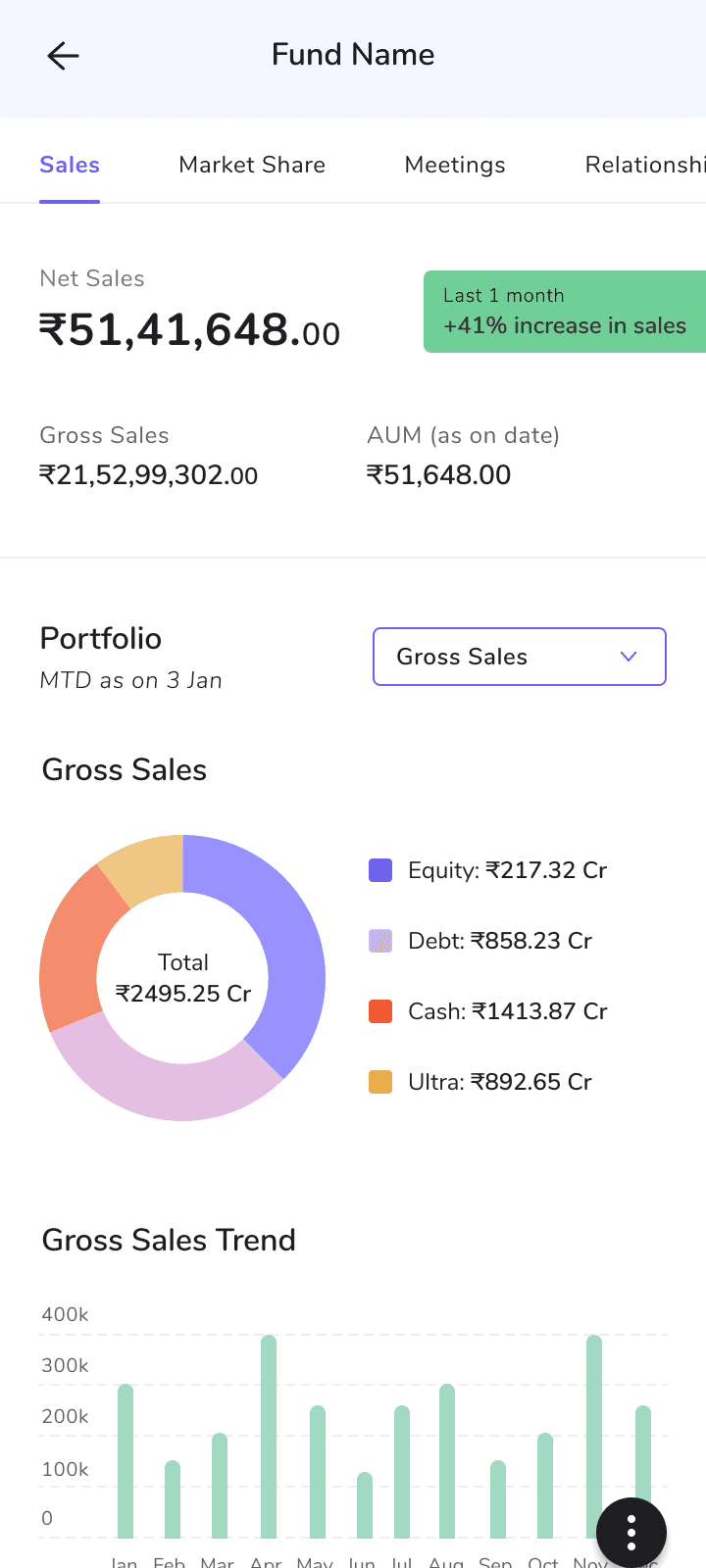
Users needed access to detailed financial information, so the goal wasn't to simplify by removing data. It was to make targets, achievements, trends and comparisons easier to interpret at a glance.
I created a clearer hierarchy between headline metrics and supporting detail, using visualisations based on the question each dataset needed to answer. Filters and drill-downs kept deeper analysis accessible without exposing every dimension upfront.
The same patterns could then scale from individual performance to team and regional views, giving different roles the depth they needed without changing how the information worked.

TURNING CUSTOMER SIGNALS INTO SALES ACTIONS
Events such as maturing SIPs, ceased SIPs, redemptions and failed transactions could represent opportunities or require follow-up. Instead of leaving them as passive information, I brought them into a dedicated Sales Acceleration workflow.
Users could move from a high-level signal into the customers behind it, select individual or multiple records, take action and review it before confirming. This created a deliberate signal → context → action flow while supporting bulk actions for users managing large customer portfolios.
The aim was to bring the next useful action closer to the insight that prompted it.

MAKING TEAM PERFORMANCE ACTIONABLE
Managers needed to do more than see who was performing well or falling behind. I designed the Team Leaderboard as an entry point, keeping comparison easy to scan while allowing managers to progressively investigate an individual's performance and portfolio.
Relevant actions were brought into the same context. Managers could congratulate team members, configure performance notifications or move into communication when something required a response.
The workflow therefore moved naturally from compare → identify → investigate → respond, rather than ending at the ranking itself.

KEEPING COMMUNICATION CLOSER TO THE WORK
Communication across different levels of the organisation often happened alongside the work being tracked. The redesign introduced direct messaging, group discussions and configurable alerts within Darpan.
I separated collaboration from monitoring: discussions supported member selection, group threads and replies, while alerts let users define parameters around events they wanted the system to surface.
This kept two different communication needs clear while reducing the gap between identifying something in the platform and coordinating around it.

KEEPING DEEP REPORTING WITHOUT LETTING IT DEFINE THE PRODUCT
Detailed reporting was still essential, with users needing access to business, performance, AUM, institutional and regional views across multiple filters and levels of aggregation.
Rather than removing this complexity, I separated everyday decision-making from deeper analysis. Important signals could surface through dashboards and workflows, while reports remained available when users intentionally wanted to investigate further.
This created a clearer distinction across the experience: dashboard for orientation, workflows for action, reports for deeper analysis.
What I learned
I learned that designing a data-heavy product is as much about prioritisation as presentation. The same information can mean very different things depending on a user's role, responsibility and context.
There’s more to the story than what’s on this page. Reach out at anjalidarbha.work@gmail.com if you’d like to see the full case study.
Designed at https://www.humanx.io/