Hobbes Health App
Designing an AI-powered nutrition experience that makes healthy eating feel less like work


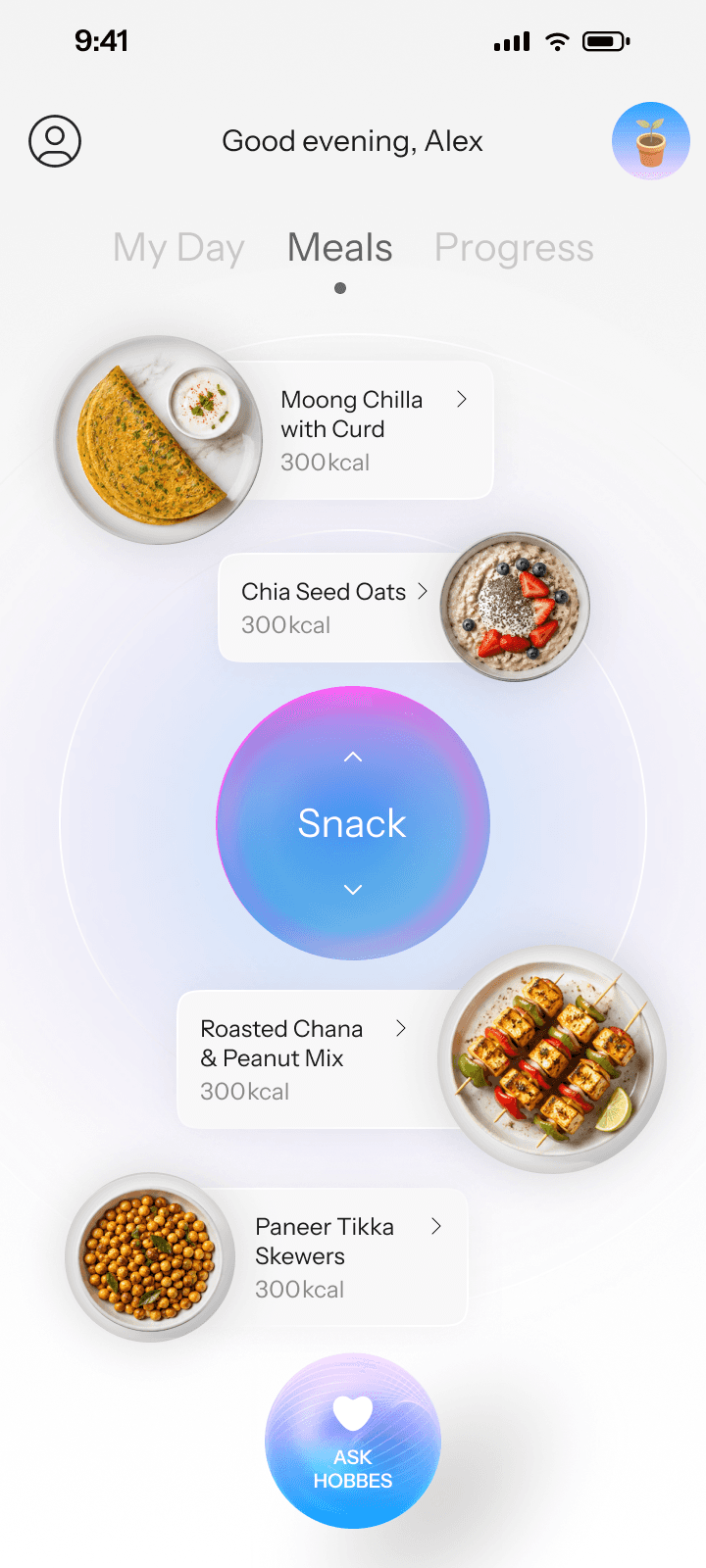


Hobbes is an AI-powered nutrition app designed to help people eat better without making healthy eating feel like another thing they have to constantly manage.
Most nutrition products ask users to do a lot of the work themselves — planning meals, logging what they eat, interpreting nutritional data and figuring out what they should change. Hobbes takes a different approach. It uses AI to understand what a person eats and what they are trying to achieve, then uses that context to make recommendations, create personalised plans and help them build better habits over time.
I worked across the product experience from the initial product thinking and information architecture through to the core flows, AI interactions and visual system.
Understanding the space
How much should an AI decide on someone's behalf?
We started by looking at how existing nutrition and wellness products approached the problem. Most of them were built around tracking: users set a goal, search for their food, enter quantities, monitor calories or macros and return regularly to check their progress.
There is value in that level of detail, but it also creates a significant amount of work for the person using the product. The more seriously someone tries to manage their nutrition, the more they can end up feeling responsible for maintaining the system itself — logging consistently, understanding the numbers and staying on top of their goals.
There was also an emotional pattern worth paying attention to. Tracking can make progress very visible, but it can also make a missed day feel like a failure. Streaks, dashboards and daily targets can motivate some people, while making others feel like they are constantly being evaluated.

We wanted Hobbes to take a different position.
This made us question whether Hobbes should compete within the same model at all. If AI could understand context and take on some of the work, how much of the process could the product take care of on the user's behalf?
Instead of asking how we could help people track their nutrition better, we started asking how we could make the product responsible for more of the work.
What we heard from users
The biggest friction wasn't knowing what to eat. It was keeping up with the process.
Through user conversations, we heard that people were often interested in improving their nutrition but struggled with the ongoing effort involved. Logging meals, remembering goals, planning what to eat and making sense of progress could quickly become another routine to maintain.
These insights gave us a fairly clear direction: make the product easier to interact with, and make progress feel encouraging rather than evaluative.

So where could AI
actually help?
We didn't want AI to be another feature. We wanted it to remove work.
Once we understood the friction, AI became interesting for a very specific reason. It could change the interaction model.
This led us to three ideas that became the foundation of the product:
Talk to Track
Plan, Don't Track
A lighter approach to habit formation and progress.
The common thread between them was that Hobbes should be doing more of the thinking in the background, while the user interacts with it in a much more natural way.
Instead of searching through a food database, you could tell Hobbes what you ate. Instead of building a meal plan yourself, Hobbes could create one based on your goals and previous behaviour. Instead of navigating through multiple dashboards to understand your progress, you could simply ask a question.
A note on the designs
Hobbes launched with an earlier visual system, and that is the design currently represented in the live product.
As the product experience evolved, I revisited the interface and explored how Hobbes could become more distinctive, expressive and cohesive visually. The below designs shown from this point onwards represent that subsequent design direction rather than the original shipped UI.
The underlying product thinking and interaction models remained the focus; the visual exploration gave me an opportunity to push how that thinking could be expressed through hierarchy, typography, colour, imagery and motion.
The distinction is intentional: the live product shows what shipped, while the work below shows how I explored taking the experience further.
The principles came out of the same tension every decision on this project ran into. Hobbes only works if it does things for you, and everything it does for you is something you no longer control.
Take enough off the user and the product starts guessing at their life. Leave too much and it's another tracking app with a chat window bolted on. Almost every argument we had was some version of that line, so we wrote it down as five rules and used them to settle the argument rather than relitigating it each time.
Hobbes does the thinking, you do the eating. If the product can work something out from what it already knows, it shouldn't ask. Every question we put in front of a user had to justify itself.
Show the state, not the verdict. The app reports where you are. It doesn't tell you whether that's good or bad. "84 of 165g" instead of "you're behind."
One idea per screen. Every screen has a single number or a single decision at its centre. Everything else supports it or gets cut.
Colour reports something. Nothing is coloured because it looks better coloured. If we couldn't say what a colour was reporting, it came out.
A missed day can't feel like failure. No broken streaks, no red empty states, no guilt language anywhere in the copy. The product's job is to make the next meal easier, not to grade the last one.
A nutrition app is mostly numbers about your body, and numbers about your body are easy to read as a verdict. So the visual problem wasn't making it look calm. It was working out how to show someone 84 of 165 grams without it landing as "you're behind."
The answer we arrived at was to make the interface almost disappear, and to put all the warmth in one or two places instead of spreading it thinly across everything.
The ground is near-white, and it isn't flat. Every screen sits on a very light grey with large blurred colour fields underneath it. It's the difference between an app that feels alive and a white admin panel.
The app reports in grey. Hobbes talks in colour. Insight cards are the only saturated surface in the product, and the assistant is the only rendered 3D object in it. So anywhere you see real colour or real material, something interpreted your data rather than just displaying it. That one rule is what holds the whole system together, and it's why the app can stay this quiet without feeling cold.
Achievements sit in a different register. Progress is data. An achievement is a keepsake. Goal badges use botanical illustration on a warm gradient, deliberately unlike anything else in the app, because the reward for three months of consistency shouldn't look like another chart.
The risk with an app this restrained is that it turns cold, which is the last thing a health product can afford. Concentrating all the colour and material into the assistant meant the interface could stay quiet and the product could still feel warm.


Making nutrition guidance feel like a conversation
The AI coach is at the centre of Hobbes, so the experience needed to feel less like a generic chatbot and more like an ongoing coach that understands the user's context. The interaction was designed around natural conversation, allowing users to talk about what they ate, ask questions and get personalised guidance without having to navigate through complex flows.
The experience also needed to make AI recommendations feel understandable and actionable, giving users enough context to trust the guidance without overwhelming them with information.
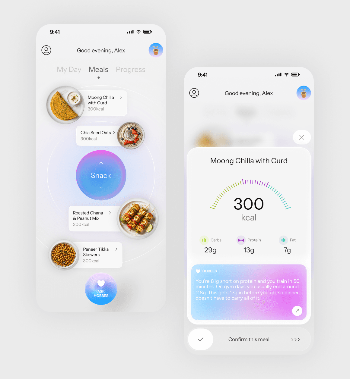
Helping people decide what to eat without planning every meal themselves
Rather than asking users to constantly track their nutrition and figure out what they should eat next, Hobbes could use their goals, preferences and previous behaviour to do more of that work for them.
The experience was shaped around reducing decision fatigue while still giving users control. Personalised recommendations provide a starting point for the day without turning them into a rigid meal plan that has to be followed perfectly.

Bringing the right context together at the right time
With meals, goals, habits and nutritional information all contributing to the experience, the challenge became deciding what someone actually needs to know when they open the app.
My Day brings the most relevant context into one place — what has happened, where things stand and what might be useful to focus on next. Rather than functioning as another dashboard, it was designed to help users understand their day without having to piece the information together themselves.

Habits that build momentum, not pressure
We deliberately moved away from conventional streaks and gamification. A missed day shouldn't reset progress or make someone feel like they had failed, so instead of counting consecutive days, we created a simple progression through three stages: Foundation, Momentum and Peak.
Each level represents a different stage of building a sustainable behaviour, giving users a sense of progression without turning nutrition into a game. The focus is on building momentum over time, rather than maintaining a perfect streak.

Helping people understand change without turning it into a score
Nutrition progress can easily become a collection of numbers, targets and charts. Hobbes takes a more contextual approach, focusing on patterns and changes that can actually help someone understand their behaviour.
The experience was designed to surface meaningful progress without making users feel evaluated. Visual emphasis is reserved for insights that need attention, while the rest of the interface stays deliberately quiet.
What I’d carry forward: designing for less, without losing context
One of my biggest takeaways from Hobbes was that simplicity is not about showing less information. It is about making less information compete for attention.
We are opening more apps, processing more information and making more decisions than ever. Adding another layer of dashboards, metrics, notifications and choices can easily create more cognitive load than value — particularly in a product like Hobbes, where the whole premise is to make healthy eating feel easier.
The challenge, then, is to understand what context a person actually needs in a moment, what the product can infer for them, and what can stay out of sight until it becomes relevant. And that has changed how I think about minimal interfaces. The best experiences aren't necessarily the ones with the fewest elements; they're the ones where every element has a reason to be there.
Designed at https://hyperlycheelabs.com/