Uplifty App
Designing a mental health experience around how people choose to seek support




Uplifty is a mental health platform centred around moderated support groups, with private journaling and 1:1 counselling providing different ways to seek support. I led the product design end to end, from understanding how people participate in sensitive online spaces to defining the UX, visual system and safety patterns across the product.
The brief
When I joined the project, the core proposition and most of the feature set were already defined. The product would bring together support groups, private journaling and access to 1:1 counsellors, giving people a few different ways to seek mental health support within the same app.
My role was to take that direction and figure out how it should actually work as a cohesive product. I mapped the journeys, worked through the interaction details and edge cases, established the information architecture, and designed the experience through to handoff.
Research ran alongside this work, helping me understand the conventions people already recognised from mental health and community products, where they created friction, and where the initial feature set could be strengthened. One of the more meaningful additions that came out of this was Topics, a forum-style community that I proposed as a lower-commitment way to learn from and interact with people beyond smaller support groups.
The goal wasn't to reinvent each of these experiences. It was to make familiar patterns work appropriately for the context they were being used in.
Understanding how people seek support
I looked across mental health products, peer communities, journaling tools and therapy platforms to understand how people were already seeking support. One behaviour became particularly useful when thinking through Uplifty: not everyone looking for support wants to participate in the same way. Some people are comfortable sharing openly, some prefer to read before they contribute, and others would rather process something privately.
I didn't treat these as fixed personas. The same person could behave differently depending on what they were going through that day. Instead, I used them as three broad modes of engagement: observe, share and reflect. This became a useful lens for the flows I was designing:
could someone understand a group before joining it?
could they get value from the community without posting?
was journaling genuinely private?
was professional support available without feeling like the expected next step?
The research also highlighted a gap in the original product. Support groups offered a smaller space to talk to others, while journaling offered somewhere completely private to reflect. But people also turn to larger online communities simply to read about experiences like their own, search for a specific problem or ask a question without committing to an ongoing group.
That led me to propose Topics, a lightweight forum organised around subjects people might want to explore. It gave people access to a broader community outside their support groups, while giving quieter users another way to get value from Uplifty without having to actively participate.
That question became a useful check across both the experience and its visual direction. Uplifty needed to feel safe enough for sensitive conversations, clear enough that people knew what to do, and approachable without feeling overly therapeutic or clinical.
Safety needed context: Groups surfaced their purpose, guidelines and moderator information before someone joined, with reporting accessible within community interactions.
Participation needed different levels: Reading, reacting, replying and starting a conversation were all valid ways to participate. The experience didn't push everyone towards posting.
Private needed to stay private: Journaling was designed as a complete experience in itself, rather than another route towards sharing with the community.
Professional support remained a choice: Counselling was easy to access without turning every other experience into a pathway towards booking a session.
The interface needed to feel approachable: A softer palette, generous spacing and approachable typography helped create a sense of ease, while a structured underlying UI kept the product functional across both member and counsellor experiences.

Intent-led home
Uplifty itself wasn't a complicated product. There were only a handful of core features, and a conventional feature-led home would have been perfectly easy to navigate. But easy to navigate didn't necessarily mean easy to enter. Someone opening a mental health app may know what they're feeling without knowing whether they need a support group, a journal, a broader community or a counsellor.
So I used the simplicity of the product to make the home screen do something more useful. Instead of repeating the navigation, it starts with what someone needs in that moment and guides them towards the relevant form of support. The navigation still gives returning users direct access to familiar features, while the home becomes an orientation layer for moments when the next step isn't as clear.

Understand the group before deciding to join it
The actual support-group conversation could stay familiar. It didn't need a new interaction model for chat. The more important UX work happened before someone entered the conversation, when they were deciding whether this was a space they felt comfortable joining.
Group pages therefore gave users context upfront: what the group was for, who it was intended for, and what members were expected to follow. Guidelines were surfaced as part of joining rather than buried in settings, and groups had limited capacity to preserve the smaller format they were intended to have. Once inside, the interaction model remained intentionally simple so the interface stayed secondary to the conversation itself.

A wider community without committing to a group
Support groups were useful for ongoing, smaller conversations, but competitor research surfaced another behaviour: people often use online communities simply to search for experiences like their own, read what others are saying or ask a question without wanting to join a group.
That led me to propose Topics, a forum-style layer that wasn't part of the original feature set. I kept it lighter than a typical social platform, organising conversations around topics users could deliberately explore rather than building an engagement-led feed. People could read, react, respond or start a discussion depending on how much they wanted to participate, giving Uplifty a broader community layer without changing the intimacy of its support groups.

Something on the page when you don't know what to write
While researching journaling approaches, I came across CBT journaling, which is more structured than simply writing down your thoughts. That led me to propose two modes for Uplifty: free journaling for open-ended reflection, and CBT-guided journaling for users who wanted more direction. The guided flow uses prompts to help identify a situation, unpack the thoughts and emotions around it, and reflect on those thought patterns more deliberately.

A counsellor when you want more than peer support
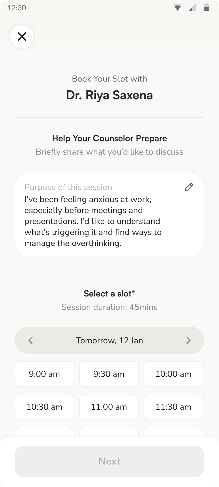
1:1 counselling was already part of Uplifty, so my focus was on making the experience of finding and booking a counsellor feel straightforward. I structured profiles around information that could help someone make that decision, including the counsellor’s expertise and approach, and kept the booking flow lightweight. The aim was to reduce the effort between deciding to seek professional support and actually scheduling a session.
Intent-led home
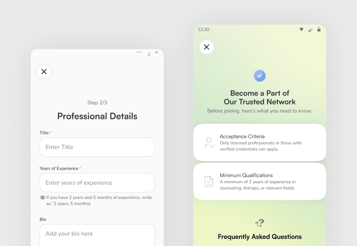
Rather than creating a separate app for counsellors, I thought Uplifty should support both sides of the experience within the same product. Someone interested in joining as a counsellor could apply directly through the app, submit their professional details for review, and only gain access to the counsellor experience once they had been verified by the Uplifty team.
From there, the product adapts to what counsellors actually need: managing their availability, keeping track of sessions and accessing the relevant client context before and after an appointment.

Making availability work around the counsellor
Rather than treating scheduling as something counsellors had to manage session by session, I designed the experience around their broader availability. Counsellors could define when they were available to take appointments, giving Uplifty the information it needed to surface bookable slots to members while keeping control of their working hours with them.

Keeping the client context with the relationship
Counselling isn't a one-off interaction, so the client experience needed to retain useful context across sessions. I organised client profiles around the ongoing relationship, bringing together relevant information and session history so counsellors could return to a client and quickly understand the context of their previous interactions.
Designed at https://hyperlycheelabs.com/